Hello, Fellow Stock Pickers
One of my favorite habits as an investor is to revisit old analyses.
Stocks I studied, passed on, and then tracked anyway
Back in 2020, I looked at two French animal-health companies: Virbac and Vetoquinol.
Both were riding the pet-humanization trend.
I didn’t buy
5 years later both lagged the index.
But Virbac still outperformed Vetoquinol by 50%...
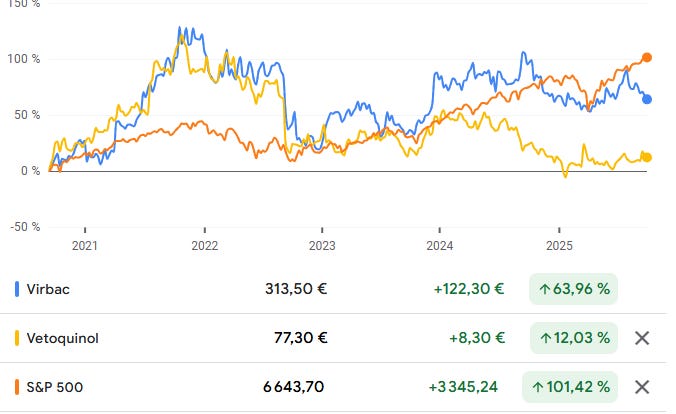
Same industry. Different outcomes.
That’s the lesson: same industry doesn’t mean same returns.
So how do you spot the difference early?
Usually it takes days of filings, calls, and notes.
This 3-step AI workflow compresses it into 37 minutes.
It’s not about skipping the work.
It’s about knowing which company deserves the work first.
Because time is your scarcest resource.
And this workflow makes sure you spend it where the payoff is highest.
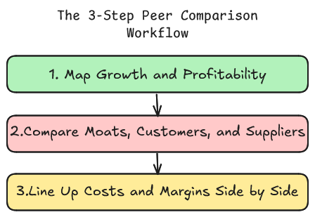
Step 1: Map Growth and Profitability
The first move is simple: find where growth and profitability really come from.
Not at the company level but at the product and geography level.
That’s where the spread shows up:
Which company has the stronger growth profile (by product × geography)
Which one converts that growth into superior margins
Where the vulnerabilities sit if the tide turns
A simple Segment–Geography scorecard to anchor your thesis
Run the prompt once and in minutes you’ll have a clean map of growth, profitability, and risks :
Act as a comparative business analyst and generate a consulting-style dossier contrasting {Company A} and {Company B} within the {Industry}. Focus on evidence-led analysis using the 80/20 principle to highlight critical components.
Objective:
- Identify which company has a higher probability of growth over the next 5-10 years, focusing on product segments and geographies.
- Determine which company exhibits superior profitability and margin profiles linked explicitly to product segments and geographies.
Inputs:
- Peers: {Company A}, {Company B}
- Industry: {Industry}
- Currency: {Currency} (state FX basis if converted)
Source Policy:
Utilize primary/high-signal sources such as audited reports, investor decks, earnings call transcripts, regulator databases, and expert market research. Append sources to each exhibit as: [Source: Title — URL — Doc date]. Use “ND” for missing data and tag inferences with brief logic. Apply ISO date format.
Normalization:
Standardize product and region labels across companies. Align channel terms. Use reporting currency; note FX basis for conversions.
Output Format:
Markdown format with tables first, and short narrative per exhibit: Context → Insight → Implication → KPI, including direct A-vs-B comparisons throughout.
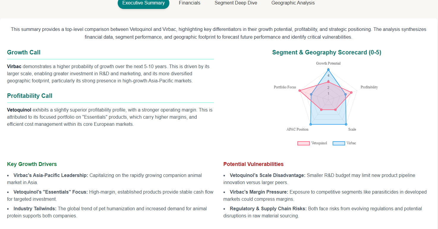
1. Executive Summary
- Growth call: Declare which business has a greater growth probability based on product × geography, including 2–3 factual reasons.
- Profitability call: State which business has better margin/earnings quality, tied to specific segments and geographies.
- Identify 3 growth drivers explaining future growth odds.
- Highlight 3 vulnerabilities that might flip growth margins.
- Provide a Segment–Geography scorecard (0–5).
- Outline 3 business KPIs for the next 12–24 months.
2. SECTION A — Top Cells: Analyze top products by country.
3. SECTION B — Price Control & Route-to-Market: Assess net price realization efficiency.
4. SECTION C — Supply Resilience: Evaluate supply sourcing and continuity.
5. SECTION D — Segment Growth Engines: Examine growth drivers and profitability.
6. SECTION E — Product & Geography Overview: Contextualize product and geographical analysis.
7. SECTION F — Competitive Landscape: Scrutinize competitive positioning.
8. SECTION G — Risks by Segment: Map potential risks.
9. SECTION H — Causal Diagnosis & Decision: Compare causal disparities and suggest KPI-driven actions.
Quality Checks:
- Ensure explicit A vs B contrasts.
- Normalize labels and currencies.
- End each exhibit with Context → Insight → Implication → KPI, and a source tag.
- Apply the 80/20 filter to prioritize impactful segments.
This step is the foundation.
With Virbac vs Vetoquinol, the report made the contrast obvious.
Step 2: Compare Moats, Customers, and Suppliers
Once you know what drives growth and profitability , the next question is simple:
Who has the real bargaining power with customers, with suppliers, with the market
It forces you to compare peers on 3 levers that decide long-term outcomes:
Moats : what the competitor can’t copy
Customer relationships : who sets the terms on price and access
Supplier links : what’s the nature of each relationship?
This is where advantage becomes visible.
Margins, growth, and resilience all tie back to these levers.
Copy the prompt. Run it in Gemini.
In minutes, you’ll know these businesses like you’ve followed them for 5 years
Act as a comparative business analyst to explain who holds power between {Company A} and {Company B} over the next 5–10 years. Focus on Moats, Customer Relationships, and Supplier Links. Exclude valuation considerations.
Objective: Determine power dynamics between the companies through:
Moats (defensible advantages),
Customer relationships,
Supplier links,
and how these three factors drive different outcomes.
Inputs:
Peers: {Company A}, {Company B}
Industry: {Industry}
Currency: {Currency}
Source Policy:
Use primary/high-signal sources only: filings, audited reports, decks, call transcripts, regulators, top-tier research/interviews. After each claim or comparison block, append sources: [Source: Title — URL — Doc date]. For missing data, mark ND. Inferences should be tagged with a brief logic and ISO dates.
Format: Write in paired bullets or short paragraphs: A: … B: … → Implication: … → KPI: …
Section M — Moats (defensible advantages)
Goal: Compare what each company has that rivals can’t easily copy, with proof.
A: [advantage], evidence (certification/standard, unique process, capacity density, brand usage, network/data lock) → durability (High/Med/Low).
B: [advantage], evidence → durability.
Implication: How this affects access, pricing, or shelf over the next 5–10 years.
KPI: Operational metric to confirm/deny each advantage.
Section C — Customer Relationships (who sets terms)
Goal: Compare buyer power, access quality, and real price setting.
A: Top channels/accounts, any >10% customer (Y/N), preferred-list/standard (Y/N), contract levers (rebates/PL/exclusivity/SLAs), sell-in vs sell-out signal, renewal/tender cadence.
B: Similar details.
Implication: Who controls net price and shelf; where margin pressure sits.
KPI: Metrics like preferred-list penetration %, sell-out ≥ sell-in in top accounts, OTIF ≥97%, renewal win rate %.
Section S — Supplier & Input Links (continuity & shock absorption)
Goal: Compare continuity risk and pass-through mechanics.
A: Critical inputs, single-source risks (Y/N), dual-sourcing coverage (Low/Med/High), tested switch lead time (Short/Med/Long), pass-through strength (Strong/Partial/Weak), notable incidents & fixes.
B: Similar details.
Implication: Who keeps shelves full at stable net price during shocks.
KPI: Metrics like dual-sourcing ≥80% of top SKUs; switch lead time ≤{X} weeks; pass-through lag ≤{Y} weeks; right-first-time ≥{Z}%.
Section T — Price/Power Triangle (apply in top 3 product×country cells)
Goal: For the 3 most material cells, state who wins and why.
Cell {Product × Country}
A: Who controls route (Direct/Distributor/Online), pocket price position (Below/Parity/Above), continuity status.
B: Similar details.
Outcome: Share ↑/→/↓ and margin ↑/→/↓ (reason).
KPI: The single metric confirming this outcome within 12–24 months.
Section X — Causal Gap & Actions
Goal: Name the few causes that explain most differences; what to change.
Driver 1 (Customer power / Supplier dependence / Advantage):
A evidence vs B evidence → Impact (Minor/Moderate/Major) → Action for laggard (what & timeline).
Driver 2 … (max 3).
KPI pack: Three business KPIs (with thresholds & dates) that will validate or flip the call.
Decision (5 lines)
Call: {A or B} holds the stronger power position for the next 5–10 years.
Why: (1) Advantage line, (2) Customer line, (3) Supplier/Continuity line.
Risk to the call (per company): + early KPI that would warn.
Action for laggard: The one operational change that could close the gap.
Quality Checks:
Direct A vs B contrast in each exhibit.
Normalize labels and currency.
Each exhibit ends with Context → Insight → Implication → KPI and a source tag.
Apply 80/20 filter to prioritize top product×country cells and segments impacting outcomes.
This step shows who controls the game.
The peer with stronger moats, stickier customers, and resilient suppliers will defend profits and keep compounding.
The summary you see below normally takes years of industry knowledge.
With AI, you get it from a single prompt
Step 3: Line Up Costs and Margins Side by Side
After mapping growth (Step 1) and power (Step 2), the next question is:
Which peer runs the more efficient cost engine?
NotebookLM makes this simple.
Upload both filings, and it lines up the cost structure side by side.
but why this matters?
Comparing peers on core metrics is the fastest way to see where the real advantage lies:
COGS % of sales → scale and sourcing efficiency
R&D % of sales → innovation and pipeline depth
SG&A % of sales → weight of the sales model
Gross margin → pricing power and mix
EBIT margin → cost discipline and profit conversion
Here’s a the prompt to use:
Compare [Company A] and [Company B] over the period [Year1–Year3]. Follow these steps:
Extract raw values (in €m) for each year from consolidated financial statements:
Revenue / Net sales
Cost of goods sold (or equivalent: purchases consumed, cost of sales, production costs, inventory change + materials)
Research & Development expense (R&D, research, development, innovation)
Selling, General & Administrative expense (or equivalent: marketing, commercial expenses, distribution, administrative, overheads, or other operating expenses excluding R&D and COGS)
Operating income / EBIT (Résultat opérationnel or operating profit)
Calculate ratios (% of sales) for each year:
COGS % of sales
R&D % of sales
SG&A % of sales (using equivalents if SG&A not explicit)
Gross margin (%) = (Revenue – COGS) ÷ Revenue
EBIT margin (%) = EBIT ÷ Revenue
Output format:
One Markdown table per company with columns: Year, COGS %, R&D %, SG&A %, Gross margin %, EBIT margin %.
Then a summary comparison table with rows = the five metrics and columns = [Company A] 3y average, [Company B] 3y average, Gap/Comment.
Finish with one short paragraph (4–6 lines) explaining which metric shows the most persistent structural difference and what it implies strategically (scale, innovation, sales model, pricing power, efficiency)
Side-by-side, the differences jump out.
Quick Recap
Step 1: Break growth and margins down by product × geography → see the real drivers.
Step 2: Compare moats, customers, and suppliers → know who controls the game.
Step 3: Line up cost structures → find the peer that runs leaner and compounds faster.
Here’s why I want you to try this: most investors waste weeks chasing filings and still miss what matters.
This workflow gives you the answer in under an hour.
It’s not about skipping the work…it’s about putting your time where the payoff is highest.
Run it once and you’ll never look at “similar stocks” the same way again.